Published on: 2023-11-21
Updated on: 2026-05-05
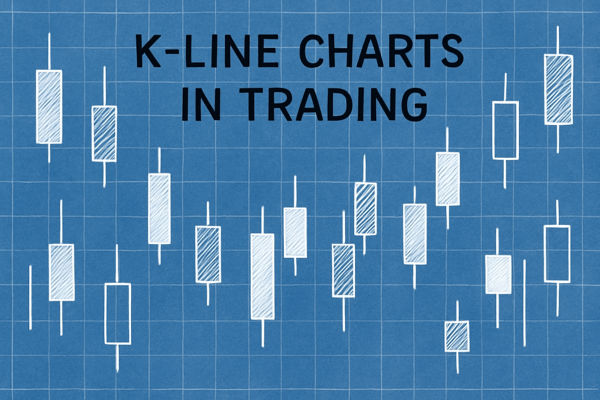
K-line charts remain one of the fastest ways to read market pressure because they turn raw price data into a visual story. In forex, indices, and commodities, one candle can show where buyers entered, where sellers rejected the price, and whether momentum is expanding or fading.
That matters more in 2026 than it did a decade ago. The 2025 FX market reached $9.6 trillion in average daily turnover, so traders need a chart format that is quick to read but still shows open, high, low, and close.

A K-line chart, also called a candlestick chart, shows price movement over a selected period: 1 minute, 1 hour, 1 day, or 1 week. Each candle represents four prices:
Open: the price at the start of the period.
High: the highest price traded.
Low: the lowest price traded.
Close: the price at the end of the period.
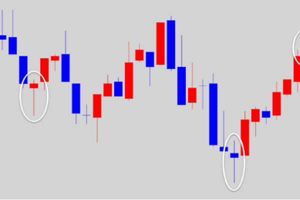
A candle has two parts. The body is the rectangle between the open and closed. The wick, or shadow, shows the highest and lowest prices reached during that period.
A green or white candle usually indicates the price closed above the open, suggesting bullish pressure. A red or black candle usually indicates the price closed below the open, indicating bearish pressure. Some platforms allow custom colours, so traders should always check chart settings first.
K-line charts originated from Japanese rice trading and later became widely known as candlestick charts. Their strength lies in compression: direction, volatility, rejection, and sentiment in one compact form.

The body shows who controlled the session. A long bullish body indicates that buyers maintained control from open to close. A long bearish body means sellers dominated. A small body means neither side gained clear control.
The body is more useful than recent candles. A large candle after several small candles can signal range expansion. A small candle after a sharp move can signal hesitation or exhaustion.
Wicks show rejection. A long upper wick indicates the price traded higher but failed to hold, suggesting supply near the resistance. A long lower wick indicates the price traded lower but recovered, often signalling demand near support.
Context decides whether the wick matters. A long lower wick at prior support, a moving average, or a major psychological level carries more weight than one in the middle of a noisy range.
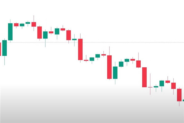
One green candle does not make an uptrend. Higher highs and higher lows across several candles show a bullish structure. Lower highs and lower lows show bearish structure.
This is where K-line charts become practical. They help traders see whether the price is trending, ranging, or reversing before applying indicators.
A single candle rarely provides enough evidence. Strong signals appear when candlestick structure aligns with support and resistance, trend direction, volume, momentum, or a macro catalyst.

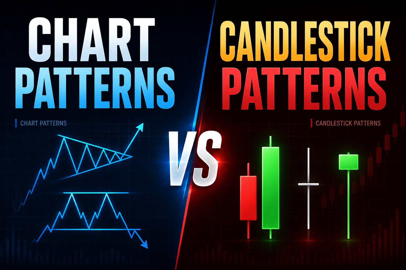
Candlestick patterns help traders organise price behaviour. They do not guarantee the next move, but they highlight moments when supply and demand may be shifting.
Single-candle patterns such as Doji, Hammer, Inverted Hammer, and Spinning Top show indecision or rejection quickly. Beginners should focus on where they appear. A Hammer after a downtrend near support is more meaningful than a Hammer in the middle of a range.
Two-candle patterns show a shift in control. A bullish engulfing pattern means buyers overcame the prior candle’s selling pressure. A bearish engulfing pattern means sellers overpowered buyers. Piercing Line and Dark Cloud Cover patterns are similar, but less decisive.
Multi-candle patterns are slower, but often cleaner. Morning Star and Evening Star patterns show a move, a pause, and a reversal attempt. Three White Soldiers and Three Black Crows show continuation, but late entries often carry weak risk-reward.
The main advantage of K-line charts is speed. Traders can see whether buyers or sellers controlled a period without having to read a table of prices. The main weakness is overconfidence. Candlestick patterns are signals, not trading systems.
Modern markets move faster, but candlesticks still matter because algorithms also respond to visible price levels. Stop clusters, round numbers, prior highs, and prior lows often create sharp candles when liquidity is triggered.
In forex, the 2025 rise in daily turnover reflected heavier hedging and volatility around policy and trade headlines. A candle near a central-bank decision or inflation release should therefore be treated differently from one formed during quiet Asian-session liquidity.
In commodities such as gold, long wicks often appear around inflation data, U.S. dollar moves, and geopolitical headlines. A strong candle can reveal safe-haven demand, but confirmation still matters because reversals can be sharp when positioning becomes crowded.
The best approach for beginners is to keep the setup simple. Start with Doji, Hammer, and Engulfing patterns, then combine them with market structure.
A practical checklist helps:
Trade bullish patterns only near support or after a pullback in an uptrend.
Trade bearish patterns only near resistance or after a rally in a downtrend.
Confirm the signal with volume, RSI, moving averages, or a break of structure.
Place the stop-loss beyond the candle wick or the nearest invalidation level.
Avoid signals immediately before major news unless the strategy is built for volatility.
Paper trading is useful because it trains pattern recognition without the emotional pressure of real trading. Traders should record screenshots, note the time frame, and review whether the candle's shape or broader structure drove its price action.
Risk management must come first. Even high-quality K-line setups fail. A trader who risks too much on one candle is gambling on a pattern.
A K-line is another name for a candlestick. It shows the open, high, low, and close for a selected time period. Traders use it to read direction, volatility, buying pressure, selling pressure, and possible turning points.
Engulfing, Morning Star, Evening Star, Hammer, and Doji patterns are widely followed. They become more reliable at key support or resistance and when confirmed by trend, volume, or momentum.
Beginners should not rely solely on K-line charts. Candles show price behaviour, but they work best with support and resistance, trend analysis, indicators, and clear risk management.
K-line charts remain essential because they show where the price opened, how far it moved, where it was rejected, and who controlled the close. The best traders do not memorise patterns blindly. They read candles in context. A Hammer near support, an Engulfing candle after a pullback, or a Doji after a stretched rally can all provide useful information when confirmed by structure and risk controls.
Disclaimer: This material is for general information purposes only and is not intended as (and should not be considered to be) financial, investment or other advice on which reliance should be placed. No opinion given in the material constitutes a recommendation by EBC or the author that any particular investment, security, transaction or investment strategy is suitable for any specific person.