Published on: 2023-12-12
Updated on: 2026-04-29
The types of candlestick patterns help traders read price action before the market explains itself in headlines. Each candle shows who controlled a session, where the price was rejected and whether market sentiment is shifting around support or resistance.
That matters in faster markets. In 2025, US stocks added 17%, the S&P 500 nearly touched 7,000, gold topped $4,500 per ounce, and Bitcoin climbed above $120,000 before retracing. Wide moves across stocks, forex, gold, and crypto made candlestick patterns useful again for reading the bulls’ defence and the bears’ counterattack.
Candlestick chart patterns visually show the open, high, low, and close.
Bullish and bearish candlesticks are strongest near clear support or resistance.
Single candle types show rejection or indecision. Two-candle and three-candle patterns show a shift in control.
Candlestick patterns need confirmation from trend, volume, RSI, MACD or moving averages.
A candlestick has six basic parts.
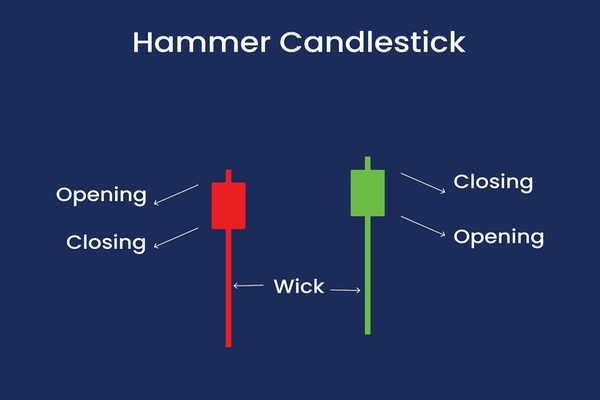
A bullish candle closes above its opening price. A bearish candle closes below its opening price. A long body shows strong buying or selling pressure. A long wick shows rejection. A small body shows hesitation. Candlesticks are built around the open, high, low and close, while wicks show the session’s extremes.
This is the foundation of all candlestick types and their meaning. Shape matters, but location matters more. A hammer near the support can signal buyer defence. The same hammer in the middle of a range may mean little.
Most trading candlestick patterns fall into four groups: single candlestick patterns, two-candlestick patterns, three-candlestick patterns, and broader chart formations confirmed by candles.
Single candle types indicate pressure in a single period. They are simple, but they need context.
A long bullish candle opens near the low and closes near the high. It shows that buyers controlled the session. A long bearish candle opens near the high and closes near the low. It shows the seller's dominant price.
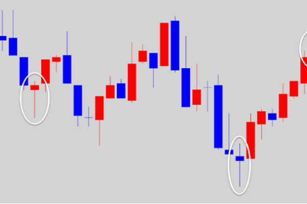
A hammer forms after a decline. It has a small body near the top and a long lower wick. Sellers pushed the price down, but buyers recovered control before the close. It works best near support.
A hanging man looks like a hammer but appears after an uptrend. It warns that sellers are testing buyer control. It is not bearish until the next candle confirms weakness.
An inverted hammer appears after a decline and shows buyers tested higher prices. A shooting star appears after a rally and shows rejection of higher prices.
A doji forms when the open and close are nearly equal. It shows indecision. A dragonfly doji candle has a long lower wick and may signal support defence. A gravestone doji has a long upper wick and may signal a rejection of resistance.
Beginner rule: single candles show pressure, but they need location.
Two-candle patterns compare the current candle with the previous one. They show whether control is changing.
A bullish engulfing pattern forms when a bullish candle covers the body of the previous bearish candle. The engulfing candlestick pattern's meaning is direct: sellers controlled the first candle, then buyers overpowered them.
Example:

A bearish engulfing pattern is the opposite. A large bearish candle covers the body of the previous bullish candle. It often shows that buyers failed and sellers are taking control.
Example:

The piercing line is a bullish reversal setup. It opens lower after a bearish candle, then closes above the midpoint of that candle. Dark cloud cover is bearish. It opens higher after a bullish candle, then closes below the midpoint.
A harami pattern shows contraction. The second candle sits inside the body of the first candle. It signals slowing momentum, but it needs confirmation.
Beginner rule: Two-candle patterns are stronger when the second candle clearly changes control.
Three-candle patterns show transition. They are slower than single-candle patterns but often easier to trust.
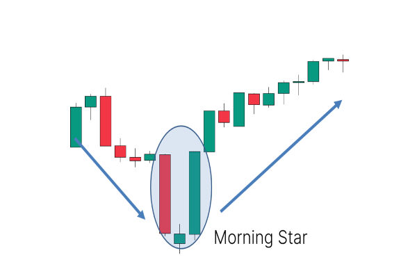
The morning star pattern is bullish. It begins with a bearish candle, continues with a small hesitation candle and ends with a strong bullish candle. It shows selling pressure fading and buying pressure returning.
Example:

The evening star is bearish. It begins with a bullish candle, continues with hesitation and ends with a strong bearish candle. It often appears near resistance after an extended rally.
Example:

Three white soldiers show three consecutive bullish candles with rising closes. Three black crows show three consecutive bearish candles with falling closes.
Beginner rule: three-candle formations are useful because they show pressure, hesitation and confirmation in sequence.
Some patterns are not single candlestick types. They are larger chart formations made from many candles.
A rounded bottom, also called a saucer bottom pattern, shows gradual accumulation after a decline. A double bottom forms when the price tests support twice and holds. Candles help confirm it when the second test produces a hammer, a bullish engulfing candle, or a breakout candle.
Assume gold has fallen for three sessions and reaches a previous support zone near $2,350. A hammer forms on the daily chart, with a long lower wick and a close near the session high.
That candle does not guarantee a rally. It shows sellers failed to hold lower prices. Traders may then look for confirmation, such as the next candle closing higher, RSI rising from oversold territory or price reclaiming the 20-day moving average.
If confirmation appears, the low of the hammer becomes the invalidation point. If the price breaks below that low, the bullish setup has failed. This turns a candlestick pattern into a trading framework, not a guess. Candlestick signals are stronger when they confirm support, resistance or another technical factor rather than standing alone.
The biggest mistake is memorising all candlestick patterns without asking where they appear. A perfect hammer in a weak location is not a strong setup.
The second mistake is confusing candle patterns with chart patterns. A doji, hammer and engulfing candle are candlestick patterns. A double bottom, triangle, and rounded bottom are chart patterns that candlestick patterns can confirm.
The third mistake is ignoring the trend. Bullish and bearish candlestick patterns work better when they align with the larger market structure.
Every candlestick trade needs a point where the idea is wrong. Without that level, the pattern becomes opinion.
There are dozens of recognised candlestick patterns, but most traders focus on single, two-candle and three-candle patterns. Common candlestick names include hammer, hanging man, doji, shooting star, bullish engulfing, bearish engulfing, morning star and evening star.
Bullish candlesticks close above their opening price, indicating buyer strength. Bearish candlesticks close below their opening price, indicating seller strength. The difference becomes more meaningful when the body, the wick, and the location support the same message.
No candlestick pattern is reliable in isolation. Patterns become stronger when they appear near support or resistance and are confirmed by trend, volume, RSI, MACD or moving averages.
Yes. Types of candles in forex help traders read sentiment around session highs, session lows, liquidity zones, support and resistance. Forex traders should be cautious during periods of low liquidity, as long wicks can create false signals.
Candlestick patterns remain useful because they turn price action into readable market behaviour. They show whether buyers defend support, whether sellers reject resistance, and whether momentum is expanding or fading.
Traders do not need all types of candlestick patterns. They need the most important patterns, the right location, confirmation and a clear invalidation point. Used this way, candlestick charts become less about prediction and more about disciplined interpretation.
Disclaimer: This material is for general information purposes only and is not intended as (and should not be considered to be) financial, investment or other advice on which reliance should be placed. No opinion given in the material constitutes a recommendation by EBC or the author that any particular investment, security, transaction or investment strategy is suitable for any specific person.