Published on: 2023-10-05
Updated on: 2026-05-15
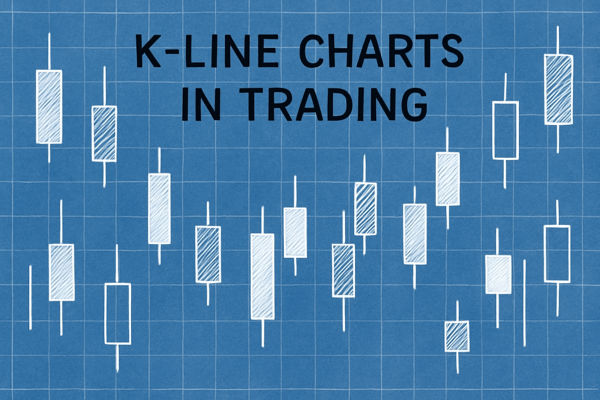
K-line candle chart secrets help traders see what the price is really saying before they enter the market. A candle is not just red or green. It shows control, hesitation, rejection, and sometimes the first warning that a trend is losing strength.
This matters more in today’s market because price moves have become faster and more event-driven. In April 2025, the S&P 500 dropped 11% in two trading days after major tariff announcements, while volatility repriced across equities, bonds, and currencies.

A large trend candle shows buyer or seller control only when it closes strongly and follows the existing market structure.
A callback trend is healthy when counter-trend candles are smaller, slower, and unable to break support or resistance.
Reversal risk rises when a strong opposite candle appears during a pullback and breaks the latest swing high or swing low.
Key price points, such as support, resistance, trend lines, and round numbers, enhance the reliability of candle signals.
Candles should be used with structure and risk control, not as isolated buy or sell signals.
A K-line candlestick chart shows four prices in a single visual: open, high, low, and close. The candle body shows the distance between the open and close. The wick shows the highest and lowest prices reached during the period.
A bullish candle closes above its opening price. A bearish candle closes below its opening price. The colour depends on the trading platform, so the important point is not the colour itself. The important point is control.
A large body shows strong directional pressure. A small body shows hesitation. A long upper wick shows rejection from higher prices. A long lower wick shows demand from lower prices.
Trend is the first secret because every candle should be read in the context of a broader direction. A trend candle is not just a candle that moves higher or lower. It is a candle that closes with conviction in the direction of the current move.
In an uptrend, strong bullish candles usually print higher highs and higher lows. Buyers are willing to accept higher prices, and pullbacks remain shallow. In a downtrend, strong bearish candles usually print lower highs and lower lows.
A large bullish candle after a clean pullback can confirm renewed demand. A large bullish candle after an extended rally may instead show late buying, especially if it leaves a long upper wick near resistance.
Gold’s 2025 rally is a good example. The metal’s record-setting move was not just a chart pattern. It reflected safe-haven demand, central-bank buying, ETF inflows, and broader macro uncertainty. In that environment, strong bullish candles had greater significance when they appeared after a consolidation and were followed by a continuation. A large candle alone was not enough. Follow-through confirmed whether institutions were still adding exposure.
A practical rule is simple: trust trend candles more when they close near the candle high in an uptrend or near the candle low in a downtrend. Be cautious when a trend candle has a long rejection wick against its direction.
A callback trend is a temporary move against the main trend. In an uptrend, it appears as a small decline or sideways pause. In a downtrend, it appears as a small rebound.
This is where many traders lose discipline. They see price move against the trend and assume the trend has ended. In reality, strong trends need callbacks. They allow early traders to take profit, late traders to enter, and the price to reset before the next move.
A healthy callback usually has three features:
The counter-trend candles are smaller than the main trend candles.
Price slows near a support, resistance, or trend-line area.
The pullback does not break the latest important swing level.
For example, if EUR/USD is rising and then prints two or three small bearish candles into a former resistance zone, the move may simply be a pullback into support. If the next bullish candle closes strongly above the short-term range, buyers still control the structure.
Trend architecture means the structure of highs and lows behind the candles. Candles show pressure. Architecture shows whether that pressure has changed the market’s direction.
An uptrend has higher highs and higher lows. A downtrend has lower highs and lower lows. As long as that structure holds, the trend remains valid even if individual candles look messy.
The reversal warning appears when candle pressure breaks the structure. In an uptrend, the key warning is a break below the latest higher low. In a downtrend, the key warning is a break above the latest lower high.
This is why candle location matters. A bearish candle in the middle of a range may only be noise. A bearish candle that closes below a higher low after price fails at resistance carries far more weight.
The three secrets can be distilled into a single practical rule.
A reversal setup becomes stronger when these three conditions appear together:
The original trend starts moving with smaller candles.
The callback produces a large candle that runs counter to the original trend.
Price breaks the trend architecture by taking out a key swing high or swing low.
This rule is not a guarantee. It is a filter. It helps traders separate a normal pullback from a possible change in control.
For example, assume the price is in an uptrend. Bullish candles shrink as price approaches resistance. A pullback begins. Then a large bearish candle closes below the latest higher low. That sequence gives a clear warning: buyers are losing control, sellers are becoming active, and the uptrend structure has weakened.
The best setups appear when this rule aligns with a key price point. A structure break near major resistance is more meaningful than a structure break in the middle of a messy range.
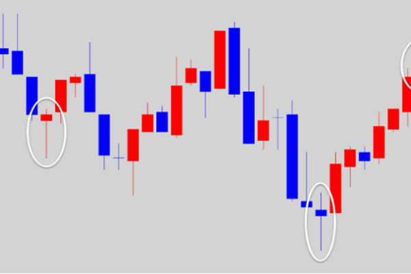
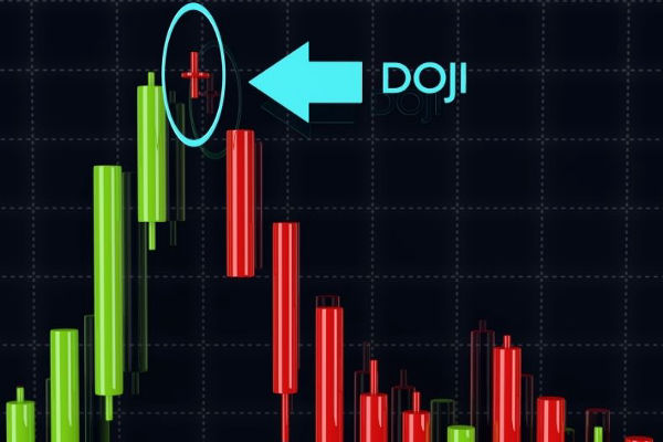
The first mistake is reading one candle in isolation. A hammer, doji, engulfing candle, or large body means little without trend direction and price location.
The second mistake is ignoring the timeframe. A reversal on a five-minute chart may only be a small callback on the one-hour chart. Traders should check whether the higher timeframe supports or contradicts the candle signal.
The third mistake is entering before confirmation. A candle can warn that momentum is changing, but traders still need a plan: entry level, stop-loss level, target, and invalidation point.
The fourth mistake is treating candle charts as prediction tools. They are not. They are interpretation tools. They help traders read pressure and structure, but they do not remove risk.
A K-line candle chart shows the open, high, low, and close for each trading period. It helps traders see whether buyers or sellers controlled the session and whether momentum is strengthening, weakening, or reversing.
The most important secret is context. A candle is only useful when it is read in the context of trend direction, callback quality, price structure, and key levels. Without context, even a strong candle can mislead traders.
A healthy callback usually has smaller counter-trend candles, slower momentum, and no break of the latest key swing level. If pullback candles grow larger and break the structure, the original trend may be weakening.
They cannot predict reversals with certainty. They can identify conditions where reversal risk is rising. The strongest warning appears when momentum weakens, an opposite candle expands, and the trend structure breaks.
No. K-line candles should be combined with support, resistance, trend structure, timeframe analysis, and risk management. Candles improve timing, but they should not replace a complete trading plan.
The K-line candle chart is useful because it turns price movement into readable market behaviour. Trend candles show control. Callback candles show whether that control remains healthy. Trend architecture shows when control may be shifting.
The strongest insight comes when all three are read together. A slowing trend, a strong opposite candle, and a break of structure can warn that the market is changing direction. Add key price points and disciplined risk management, and the K-line candle chart analysis becomes a practical framework for better entries and better trade selection.
Disclaimer: This material is for general information purposes only and is not intended as (and should not be considered to be) financial, investment or other advice on which reliance should be placed. No opinion given in the material constitutes a recommendation by EBC or the author that any particular investment, security, transaction or investment strategy is suitable for any specific person.