Published on: 2025-10-30
Updated on: 2026-07-22
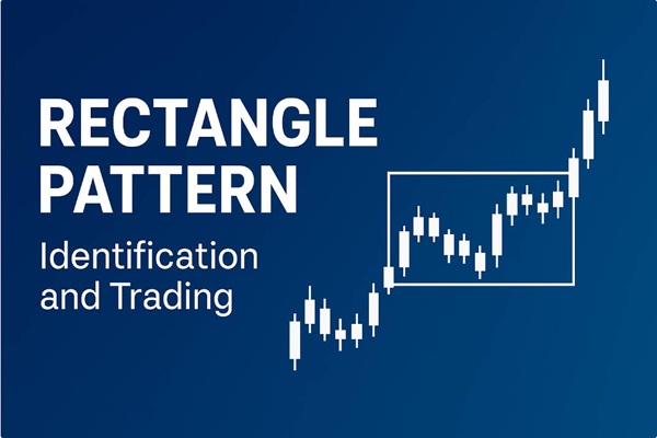
A rectangle chart pattern forms when price moves sideways between two horizontal lines: a support level along the lows and a resistance level along the highs. Price bounces between these two boundaries several times, creating a shape that looks like a box on the chart.
The rectangle is one of the most common patterns in any market, because it is simply a picture of buyers and sellers in balance. Neither side can push price past the other’s line, so price stalls until one side wins. The pattern is neutral while it forms. It only turns bullish or bearish when price closes clearly outside one of the boundaries.
A rectangle is a sideways range bounded by horizontal support and resistance, with at least two touches on each line.
The rectangle pattern is a neutral pattern until price closes beyond a boundary, where the break is usually more often a continuation of the earlier trend than a reversal.
The standard price target is the height of the rectangle projected from the breakout point, which traders use as an estimation.
Volume has no fixed pattern inside a rectangle, but it expands on the breakout.
False breakouts are common, as a close beyond the level, rising volume, and a successful retest are the main filters traders use to reduce them.
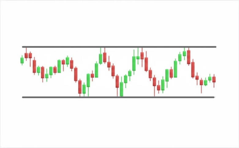
A rectangle is a price area bounded on the top and bottom by horizontal, or near-horizontal, lines. It can act as either a reversal or a continuation pattern depending on the direction in which price finally breaks out.
The upper line is resistance: a price ceiling where sellers repeatedly step in. The lower line is support: a price floor where buyers repeatedly step in. For a range to count as a rectangle, price needs to touch each line at least twice. More touches make the pattern more reliable, because each touch confirms that traders are defending that level.
The rectangle goes by several names. You may see it called a trading range, a consolidation, or a congestion area. These describe the same structure. “Rectangle” is the name used when the shape is treated as a chart pattern with a measurable target.
A rectangle is a standoff. Inside the range, buyers are willing to buy at the support line, and sellers are willing to sell at the resistance line. Every time price reaches the top, sellers overpower buyers and push it back down. Every time it reaches the bottom, buyers overpower sellers and push it back up.
This continues until one group runs out of orders. When buyers finally absorb all the selling at resistance, price breaks upward. When sellers overwhelm the buying at support, price breaks downward. The longer the range lasts, the more significant the eventual breakout tends to be, because more orders have built up on both sides.
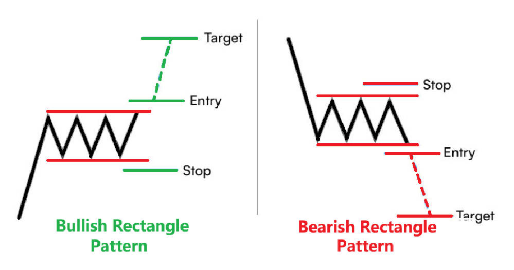
The labels bullish and bearish describe how the rectangle resolves, not the shape itself.
A bullish rectangle forms during an uptrend. Price pauses, moves sideways in a box, and then breaks out through the top to continue higher. The sideways move is a rest inside a rising market.
A bearish rectangle forms during a downtrend. Price pauses in a box, then breaks down through the bottom to continue lower.
Because the rectangle is neutral while it forms, you cannot know for certain which way it will break until it does. The historical tendency is useful here.
Thomas Bulkowski found that rectangles which develop after an uptrend (he calls these rectangle tops) break upward about 63% of the time. Rectangles that develop after a downtrend (rectangle bottoms) break upward about 59% of the time. So the prior trend gives a lean, but it is far from certain, and planning for both outcomes is sensible.
Most rectangles are continuation patterns. Price pauses, then resumes in the same direction it was already moving. This fits the idea of the pattern as a rest stop in an existing trend. The CME Group notes in its technical-analysis education that price tends to leave a consolidation in the same direction it entered.
But a rectangle can also mark a reversal. If price enters the box moving up and then breaks down through support, the pattern has flipped the trend. This is why waiting for the actual breakout matters more than guessing from the prior trend alone. The pattern tells you the direction only at the moment of the break.
Use these criteria to confirm a valid rectangle rather than random sideways noise:
Two clear horizontal boundaries. The highs line up along a flat resistance level. The lows line up along a flat support level. The two lines run roughly parallel.
At least two touches on each line. Bulkowski uses a stricter guideline: price should touch one line at least three times and the other at least twice, so five touches in total. The more touches, the more valid the pattern.
A prior trend. For the rectangle to work as a continuation pattern, there should be a clear uptrend or downtrend leading into it.
Enough time. A sideways move that lasts less than three weeks is usually treated as a flag, not a rectangle. On the daily chart, rectangles often take around three months to form, according to StockCharts. Shorter ranges appear on shorter timeframes.
A quick way to test a suspected rectangle: can you draw two horizontal lines that each connect at least two turning points, with price contained between them? If yes, and there is a trend leading in, you likely have a rectangle.
Many guides claim that volume always falls during a rectangle. That is an oversimplification. StockCharts, in its ChartSchool reference, states plainly that rectangles do not show a standard volume pattern. Sometimes volume declines steadily as the range develops. Other times it stays choppy as price swings between the two lines.
The volume signal that counts is at the breakout. A genuine breakout usually comes with a clear rise in volume, which shows real commitment behind the move. If volume was drifting lower during the range, look for it to expand sharply as price clears the boundary. A breakout on weak volume is more likely to fail.
You can read more about how traders use trading volume to confirm price moves in our related guide.
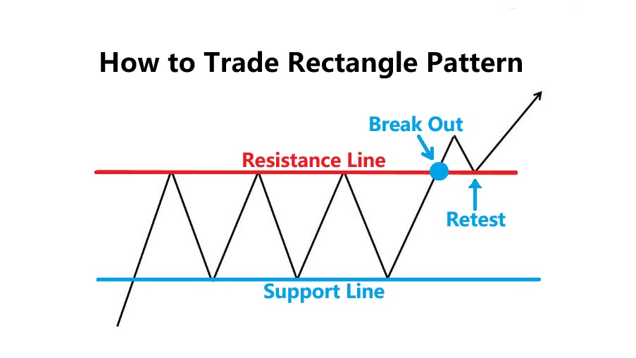
There are two common approaches, and they suit different traders.
Range trading happens inside the box, before any breakout. A range trader buys near support and sells near resistance, repeating the trade as price bounces. The risk is that price breaks out against the position, so stops sit just outside the range.
Breakout trading waits for price to leave the box. This is the more widely taught method for the rectangle, because the breakout is where the pattern gives its clearest signal. The rest of this section focuses on the breakout approach.
A breakout is only worth acting on once it is confirmed. Traders use these filters, drawn from standard technical-analysis practice:
Wait for a close beyond the level. A candle that closes above resistance, or below support, carries more weight than a wick that briefly pokes through and pulls back. Intraday spikes often fail.
Look for a volume increase. Rising volume on the breakout candle shows the move has backing.
Consider a filter. StockCharts notes that some traders require price to move a set percentage past the level, for example 3%, or to hold beyond it for a set time, such as three days, before treating the breakout as valid.
Watch for a retest. After breaking out, price often returns to the broken boundary. Broken resistance becomes new support, and broken support becomes new resistance. A retest that holds gives a second, lower-risk entry. Bulkowski’s data shows this return move, often called a throwback or pullback, happens in roughly two-thirds of rectangles.
The stop-loss usually sits just inside or beyond the opposite boundary. For an upside breakout, that means placing the stop below the resistance line that price just cleared, or below the range low if you want more room. This keeps the risk defined by the pattern itself.
The price target uses the measured move. Measure the height of the rectangle (resistance minus support), then project that distance from the breakout point in the direction of the break.
Here is a worked example on a currency pair:
A rectangle forms on EUR/USD between support at 1.1000 and resistance at 1.1200.
The height of the rectangle is 1.1200 − 1.1000 = 200 pips.
Price breaks and closes above 1.1200.
The measured target is 1.1200 + 200 pips = 1.1400.
A trader entering at 1.1200 with a stop at 1.1100 (below the broken level) is risking 100 pips to aim for 200 pips, a reward-to-risk ratio of about 2 to 1.
Treat the full target as an estimate rather than a guarantee. Bulkowski’s figures show the full measured move is reached about 78% of the time on upside breakouts from rectangle tops, and far less often on downside breakouts. Many traders take partial profit before the target and move the stop to protect the position.
You may find guides on support and resistance and on trading breakouts useful for building the entry and exit around this pattern.
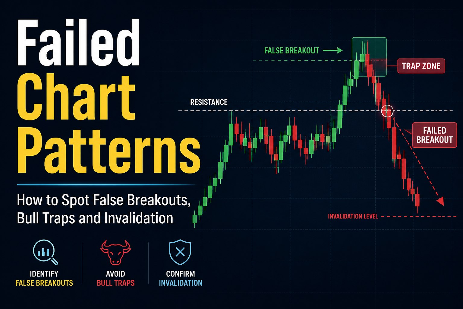
A false breakout, sometimes called a fakeout, is when price pushes past a boundary, pulls traders in, then falls back inside the range. Rectangles produce these often, because the boundaries are watched by many traders and attract clustered orders.
To reduce the chance of being caught:
Require a decisive close beyond the level, not just an intraday touch.
Require volume expansion on the breakout candle.
Wait for a retest that holds before committing, if your style allows.
Keep the stop just back inside the range, so a failed breakout costs little.
Exit promptly if price re-enters the rectangle after you have entered. A breakout that fails to hold is a warning, not a dip to buy.
No filter removes false breakouts entirely. The goal is to make the failed trades small and the successful ones large enough to more than cover them.
Rectangles appear in every market: forex, indices, commodities, stocks, and crypto. The pattern is a picture of supply and demand in balance, and that happens everywhere price is set by buyers and sellers.
They also appear on every timeframe, from one-minute charts to weekly charts. Higher timeframes are generally considered more reliable, because each level is tested by more participants and there is less random noise than on very short intraday charts. A rectangle on the daily or four-hour chart carries more weight than one on the one-minute chart.
The rectangle is part of the wider family of chart patterns. Once you can read it, patterns like flags, channels, and double tops become easier to tell apart.
The rectangle is easy to confuse with a few other formations. The differences matter, because they change how you trade.
| Pattern | How it differs from a rectangle |
|---|---|
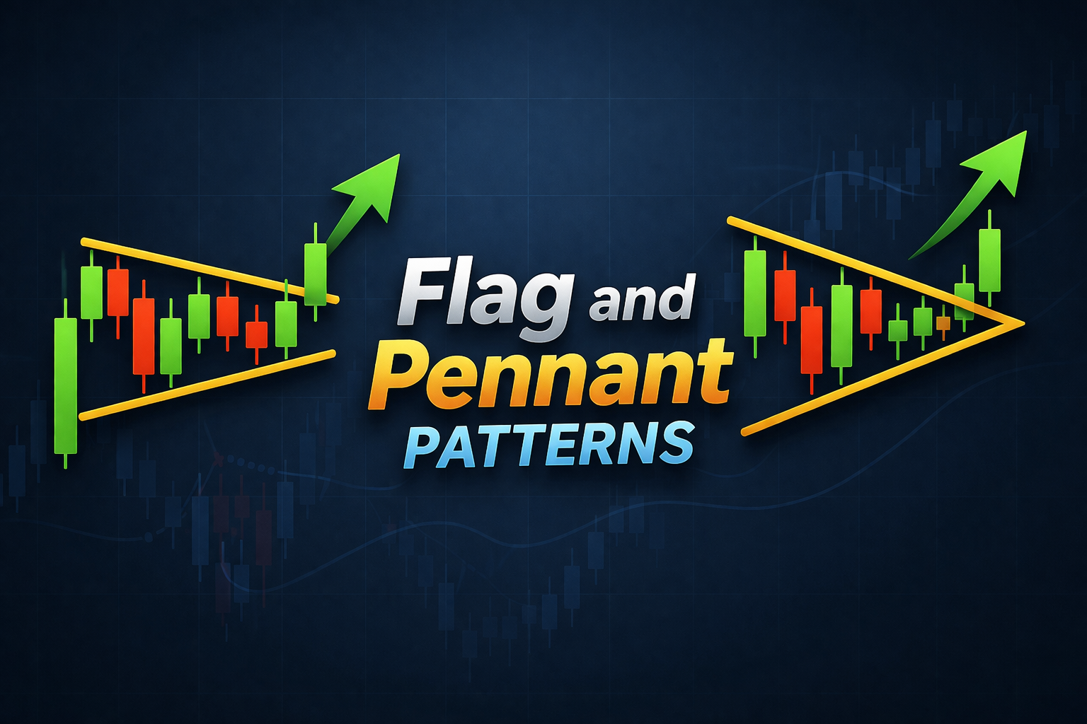
| Flag | Shorter, usually under three weeks, and often tilted against the trend rather than flat. |
| Channel | Boundaries slope up or down together, rather than running horizontally. |
| Double top or bottom | Only two clear peaks or troughs, not a sustained range with repeated touches. |
| Symmetrical triangle | Boundaries converge toward each other. A rectangle’s boundaries stay parallel. |
Neither on its own. The rectangle is neutral while it forms. It becomes bullish when price closes above resistance and bearish when price closes below support. The break tends to follow the prior trend, but not always.
They wait for a candle to close above the resistance line, ideally on rising volume. Many also wait for price to return and retest the broken resistance as new support before entering. Some apply a percentage or time filter to avoid acting on a brief spike.
Measure the height of the box (resistance minus support) and project that distance from the breakout point. For a range of 1.1000 to 1.1200, the 200-pip height added to an upside break at 1.1200 gives a target near 1.1400. Treat it as an estimate, not a guarantee.
Usually a continuation, meaning price resumes its earlier direction after the pause. It can also mark a reversal if price breaks against the prior trend. The breakout direction decides which it is.
At least two touches on each boundary, so four points in total. A stricter guideline used by Thomas Bulkowski asks for at least three touches on one line and two on the other. More touches make the pattern stronger.
Both have parallel boundaries, but a flag is shorter, generally under three weeks, and often slopes against the trend. A rectangle is longer and runs horizontally.
Higher timeframes such as the four-hour, daily, and weekly charts are generally more reliable, because their levels are tested by more traders. Intraday rectangles form often but carry more noise.
Require a clear close beyond the boundary, look for a rise in volume, and where possible, wait for a successful retest. Keep the stop just back inside the range and exit quickly if price falls back into the box.
The rectangle is one of the clearest pictures a chart can give you: two horizontal lines, a balance between buyers and sellers, and a resolution when one side wins. Its value is not in predicting the breakout direction in advance, which no pattern can do reliably, but in giving you a defined structure. You get a clear level to trade against, a logical place for a stop, and a measurable target.
The traders who use it well are the ones who wait for confirmation rather than anticipating the break, who size the trade so a false breakout costs little, and who treat the measured move as a probable outcome rather than a certain one. Read that way, the rectangle is less a prediction and more a framework for managing a trade with the odds and the risk, both clearly in view.
Disclaimer: This material is for general information purposes only and is not intended as (and should not be considered to be) financial, investment or other advice on which reliance should be placed. No opinion given in the material constitutes a recommendation by EBC or the author that any particular investment, security, transaction or investment strategy is suitable for any specific person.