Published on: 2025-03-20
Updated on: 2026-07-21
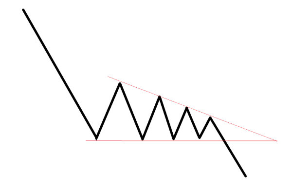
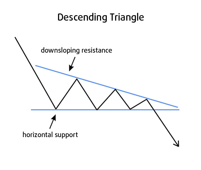
A descending triangle is a chart pattern formed by two trendlines: a flat, horizontal support line along the lows, and a downward-sloping resistance line connecting a series of lower highs. It is also called a falling triangle. Price coils between these two lines until it breaks out of one of them.
Most traders treat the descending triangle as bearish, especially when it forms inside a downtrend, because the lower highs show buyers stepping in at progressively weaker levels while sellers keep defending the same floor.
That reading is reasonable. But the statistics complicate the simple label. In a large study of the pattern by Thomas Bulkowski, based on more than 1,300 measured cases, the descending triangle broke out upward 53% of the time and downward about 47% of the time (Bulkowski, thepatternsite.com, data current 2026).
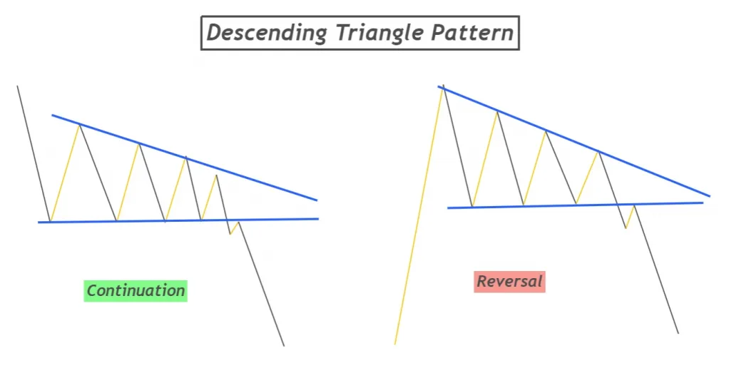
A descending triangle has a horizontal support line and a descending resistance line of lower highs.
It is usually read as bearish in a downtrend, where it acts as a continuation pattern.
Measured data shows it breaks out upward 53% of the time, so the “always bearish” shortcut is wrong.
The classic price target is the height of the triangle projected from the breakout point.
A break that fails and reverses is called a false breakout or bear trap, and it is common.
The pattern is defined by its two boundary lines. The support line is horizontal, or close to it. Price falls to a similar low several times and holds there, which marks a level where buying demand repeatedly appears.
The resistance line slopes down. Each rally peaks lower than the one before, forming lower highs. This is the descending part of the name, and it tells you that each attempt to push higher is meeting more selling.
As the two lines converge, the trading range narrows. To count as a valid pattern, price should touch each line at least twice, so you can draw both lines with confidence. More touches make the pattern clearer. The point where the two lines would meet is called the apex.
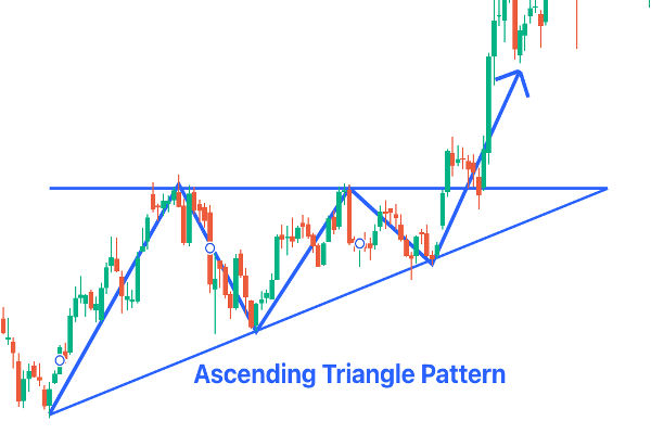
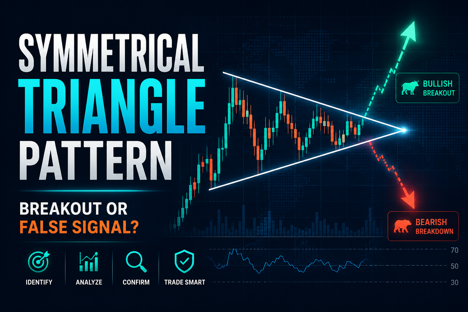
The descending triangle is a right-angle triangle: one line is flat, and one is sloped. This is the opposite arrangement of the ascending triangle, which has a flat top and a rising support line, and it differs from the symmetrical triangle, where both lines slope toward each other. For the wider family, see the chart patterns hub.
The descending triangle has a bearish bias while it is still forming, particularly inside a downtrend. The lower highs signal that buyers are weakening relative to sellers. If price breaks below the horizontal support, that is the expected bearish resolution, and traders read it as a continuation of the existing move down.
John Murphy, in Technical Analysis of the Financial Markets (1999), classifies triangles as continuation patterns and notes the descending triangle carries a definite downward bias before the break.
The statistics, however, do not support treating it as automatically bearish. Bulkowski’s measured data found the pattern broke out upward 53% of the time. He also found that if price rises into the pattern, it breaks out upward 63% of the time (Bulkowski, thepatternsite.com).
In other words, the direction price was already travelling matters a great deal. A descending triangle at the end of an uptrend can resolve upward as a bullish continuation, while the same shape in a downtrend more often continues down.
So the practical reading is:
In a downtrend, expect a downward break, but confirm it rather than assume it.
In an uptrend, an upward break is more likely than the shape alone suggests.
Wait for the actual breakout. The shape gives you a bias, not a decision.
This nuance is why blanket claims that the pattern “breaks down around 64% of the time,” which appear on many sites without a source, do not match the measured record. Where a specific number matters to you, check who measured it, on what market, and when.
The descending triangle is a picture of a shifting balance between buyers and sellers. Buyers keep defending one price level, which draws the flat support line. Every time price reaches that floor, enough buying appears to hold it.
Sellers, meanwhile, become more aggressive: they sell at lower and lower levels on each bounce, which draws the falling resistance line. The gap between the two sides narrows until one gives way.
If support finally breaks, it suggests the buyers defending that floor have run out, and price can fall quickly as their orders are cleared. If resistance breaks instead, it suggests the selling pressure has been absorbed, and buyers have taken control.
Understanding this balance matters more than memorising the shape. The pattern is a record of support and resistance being tested repeatedly, which is why reading those levels well is the foundation for reading any triangle.
Duration varies with the timeframe of the chart. On daily charts, patterns commonly develop over several weeks to a few months. StockCharts notes the average lasts from one to three months.
Higher timeframes, such as the 4-hour and daily charts, tend to produce cleaner, more reliable patterns than very short intraday charts, which generate more lower-quality signals.
Bulkowski also found that the breakout usually happens well before the apex: the median distance to the breakout was around 61% to 65% of the way to the point where the lines meet.
A pattern that drifts all the way into the apex without breaking loses much of its force, a point Edwards and Magee made in the classic text Technical Analysis of Stock Trends.
Volume usually falls while the pattern forms. The narrowing range and quieter volume reflect a market waiting for a decision. Bulkowski found volume trends downward about 78% of the time and gets quite low just before the breakout.
On a downside break, many traders look for volume to rise as confirmation that the move has conviction. StockCharts describes volume expansion on the break as preferred rather than strictly required. A breakout on weak volume is more prone to failing.
A breakout is generally counted when price closes beyond one of the trendlines, not merely when it pokes across during a candle. A close carries more weight than an intra-bar spike.
After the break, price often returns briefly to the broken line before continuing. A return to broken support after a downside break is called a throwback or pullback.
Bulkowski measured throwbacks and pullbacks occurring around 58% to 60% of the time. Broken support, once breached, often acts as resistance on that retest. Traders tend to take one of two approaches to timing:
Aggressive: act on the initial close beyond the line.
Conservative: wait for the retest of the broken line to see whether it holds as new resistance or support before acting.
Neither approach removes risk. A retest that fails is one of the clearest signs of a false breakout.
The standard method is the measured move. Measure the height of the triangle at its widest part, which is the vertical distance from the horizontal line to the first, highest peak. Then project that distance from the breakout point: subtract it for a downside break, add it for an upside break.
StockCharts gives a worked stock example: if the widest part of the triangle is 9 points (54 minus 45) and support breaks at 45, the downside target is around 36.
The same method applies to forex, gold, or an index. Suppose EUR/USD forms a descending triangle with support near 1.1000 and lower highs at 1.1200, 1.1150, and 1.1100. The height is about 200 pips (1.1200 minus 1.1000).
A break below 1.1000 projects a measured target near 1.0800. This is a rule of thumb, not a guarantee. Bulkowski found downside breaks reached the measured target about 50% of the time, and upside breaks about 64% of the time, so many moves fall short.
Stop placement is about defining where the pattern would be proven wrong.
On a short position after a downside break, traders commonly place a stop above the most recent lower high or above the descending resistance line, since a move back above those levels breaks the bearish structure.
On an upside break, the logic is mirrored, with a stop below the broken resistance or the last swing low.
The wider the triangle, the wider the stop needs to be, which changes the position size a trader can carry for a given level of risk. This is where the pattern connects to risk and money management position sizing: the chart shows the levels, but position sizing decides how much a wrong read costs.
A false breakout happens when price breaks a line, fails to follow through, and reverses back into the pattern.
When a downside break fails and price snaps back up, it is often called a bear trap, because traders who sold the break are caught on the wrong side and their buying to exit can fuel a sharp move the other way.
False breaks are common, which is the main reason many traders wait for a close beyond the line, look for volume confirmation, or wait for the retest. Bulkowski’s break-even failure rate, the share of patterns that move less than 5% after the break, was around 22% for upward breaks and 23% for downward breaks. Roughly one in five patterns barely moves at all.
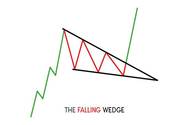
These two are often confused because both slope downward, but they mean different things.
Feature |
Descending triangle |
Falling wedge |
Lower line |
Horizontal support |
Downward-sloping support |
Upper line |
Downward-sloping resistance |
Downward-sloping resistance |
Both lines slope down |
No, only the top |
Yes, both |
Common bias |
Bearish, especially in a downtrend |
Typically bullish |
The key visual difference is the lower boundary. A descending triangle has a flat floor. A falling wedge has a floor that also slopes down, with both lines tilting the same way.
Reliability depends on how you measure it and on the market. The most complete public dataset comes from Bulkowski, drawn largely from US stocks. His headline figures for the pattern (bull market conditions) are:
Breakout direction: upward 53% of the time.
Break-even failure rate: about 22% up, 23% down.
Average move after the break: about 38% on upward breaks, about 15% on downward breaks.
Throwback or pullback: about 58% to 60% of the time.
Share reaching the measured target: about 64% up, 50% down.
Two honest caveats belong with these numbers. First, Bulkowski notes the pattern’s performance has weakened over the decades, dropping by almost half since the 1990s, so older statistics flatter it.
Second, these figures come mainly from stock data. Their application to forex, gold, or indices is directional, not guaranteed. Treat all of this as historical tendency, not prediction.
The pattern appears on any freely traded market because it reflects general buyer and seller behaviour, not something unique to stocks. Traders identify descending triangles on major currency pairs, gold, stock, or indices.
That said, the published reliability statistics were measured on stocks. Different markets have different volatility and liquidity, so the same shape can behave differently. The reading approach stays the same across markets: find the flat support and the falling resistance, wait for a confirmed break, and measure the target from the height of the pattern. You can apply and test these ideas on a chart using standard trading platform tools.
It has a bearish bias while forming, especially in a downtrend, where it usually acts as a bearish continuation. But measured data shows it breaks 53% of the time across all cases, so it is not automatically bearish. The direction of the break, confirmed by a close beyond a trendline, is what matters.
Usually a continuation pattern. In a downtrend, it tends to continue the downtrend on a downside break. It can act as a reversal when it forms at the end of an uptrend and breaks lower, or when it breaks upward against a prior decline.
Traders typically look to act when price closes below the horizontal support line. Conservative traders wait for price to retest that broken support from below and fail to reclaim it before acting. This is an explanation, not advice.
Measure the height of the triangle at its widest part, then subtract that distance from the breakout price for a downside break, or add it for an upside break. It is an estimate, and many moves fall short of it.
In Bulkowski’s stock data, its break-even failure rate is around 22% to 23%, meaning roughly one in five patterns barely moves after the break. Reliability weakened over recent decades, and figures from stocks do not transfer exactly to other markets.
A descending triangle has a flat support line and a falling resistance line. A falling wedge has both lines sloping downward. The flat floor is the giveaway for a descending triangle.
The descending triangle is a coiling pattern of lower highs pressing against a flat floor, and it is one of the most misread shapes in technical analysis.
The common label of “bearish” holds up in a downtrend, but the measured record shows upward breaks are actually a little more frequent overall, and the direction price was already moving is a strong clue to how it resolves.
The most useful habit is to stop predicting the break from the shape alone. Draw the two lines, note the bias, then wait for a confirmed close and let the market show its hand.
The one number worth remembering is not a success rate, but the failure rate: about one pattern in five barely moves after the break, which is why confirmation, not the shape, is what traders act on.
Disclaimer: This material is for general information purposes only and is not intended as (and should not be considered to be) financial, investment or other advice on which reliance should be placed. No opinion given in the material constitutes a recommendation by EBC or the author that any particular investment, security, transaction or investment strategy is suitable for any specific person.