Published on: 2025-02-12
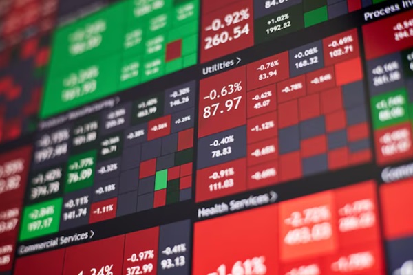
A stock heatmap typically consists of a grid in which each stock is represented by a colored box. The color of each box reflects the stock's performance over a specified period, such as a day, week, or month. Stocks that have increased in value are displayed in green, while those that have declined are shown in red.
The intensity of the color typically corresponds to the magnitude of the price change; a deeper shade of green indicates strong positive performance, while a deeper shade of red signifies significant underperformance.
Most heatmaps scale each tile according to market capitalization, resulting in the largest companies occupying the most visual space. This approach aligns the map with index composition, as significant movements in a few mega-cap stocks can influence the index even if the majority of stocks remain unchanged. However, this method can also lead to misinterpretation, as a heatmap may appear positive overall while market breadth remains weak if only a few large companies are driving the movement.

Platforms generally make this explicit. FINVIZ, for example, presents a market map where stocks are grouped by sector and industry and tile size reflects market cap, allowing fast visual attribution of index moves.
The grid typically groups stocks by sector or industry, enabling users to quickly assess sector performance. For example, a heatmap displaying all technology stocks allows for immediate identification of companies exhibiting strong or weak performance. This approach is particularly effective for detecting trends within specific sectors rather than focusing solely on individual stocks.
Now that you have a basic understanding of what a stock heatmap is, how do you use it in your trading? Stock heatmaps are most valuable when you use them to quickly identify market trends or potential investment opportunities.
If you are looking at a heatmap showing the performance of all companies in the energy sector, and most of the stocks are green, it can indicate the sector is on an upward trajectory. On the other hand, if most of the stocks in a particular sector are red, it can signal stress in that pocket of the market.
Some advanced heatmaps allow users to filter stocks by additional criteria such as market capitalization, trading volume, or volatility. This added level of detail can refine analysis and help distinguish sustained market movements from short-lived fluctuations.
1) Start broad, then narrow.
Begin by examining a broad index heatmap, such as those for the S&P 500, Dow, or Nasdaq 100. Assess whether the map displays uniform positive or negative performance, or if results are concentrated within a specific sector.
2) Validate breadth and concentration.
If a small number of oversized tiles dominate, treat the move as a concentrated one. That often means higher reversal risk if sentiment shifts, because leadership is narrow.
3) Drill into the sector map.
Click the sector block to open the detailed view and isolate the industries within the sector responsible. On TradingView, sector drill-down preserves the same sizing and colour settings, which keeps comparisons consistent.
4) Move from “signal” to “setup”.
Use the heatmap to generate a shortlist of candidates, then confirm selections by analysing price structure (trend, support, and resistance), liquidity (volume), and relevant catalysts, such as earnings, guidance, or macroeconomic data.
Heatmaps are particularly effective during periods of rapid leadership rotation, as sector transitions often become visually apparent before they are widely recognized. Early 2026 has demonstrated the speed with which market sentiment can shift between themes. Within US equities, technology leadership has experienced periods of decline and rotation, while other sectors have intermittently assumed market leadership.
A heatmap does not forecast sector rotation, but it assists in identifying such shifts as they occur, which is important for effective timing and risk management.
The following table illustrates how a sector map can be converted into a concise, decision-ready reference. The essential comparison is between sector weight, which reflects its significance within the index, and recent performance, which indicates momentum.
| S&P 500 Sector | Weighting in Index (%) | Trailing 6-Month Performance (%) | Trailing 12-Month Performance (%) |
|---|---|---|---|
| Communication Services | 11.0 | 26.6 | 30.0 |
| Consumer Discretionary | 10.4 | 14.2 | 5.5 |
| Consumer Staples | 5.0 | 8.8 | 10.6 |
| Energy | 3.2 | 19.7 | 18.9 |
| Financials | 12.9 | 5.7 | 6.9 |
| Health Care | 9.4 | 19.8 | 7.5 |
| Industrials | 8.6 | 12.7 | 24.1 |
| Information Technology | 33.4 | 10.1 | 28.5 |
| Materials | 2.2 | 15.5 | 14.5 |
| Real Estate | 1.9 | 1.7 | 3.2 |
| Utilities | 2.2 | 0.7 | 12.0 |
How to read this with a heatmap mindset: a sector can “look” dominant on a heatmap because of its weighting, not necessarily because participation is broad. When a heavyweight sector has strong trailing performance, it often sets the market tone. When a heavyweight sector is mixed with smaller sectors that are leading, it can signal a regime shift toward broader participation.
The primary advantage of stock heatmaps is their capacity to convey substantial information in a clear and accessible format. Users can quickly identify which stocks, sectors, or industries are performing well without the need to examine individual charts. Additionally, heatmaps facilitate the identification of patterns and trends over time.
However, there are some limitations to stock heatmaps.
Speed of diagnosis: Heatmaps answer “where is the money going” in seconds.
Attribution: They clarify whether an index move was driven by a single sector, a single industry, or a handful of mega-caps.
Triage: They help prioritise research time by highlighting outliers worth deeper work.
Heatmaps only give you a snapshot of performance based on price changes. While this helps gauge short-term direction, it does not tell you much about fundamentals. A stock might look green because its price has increased recently, but that does not necessarily mean the company’s outlook has improved. Heatmaps can also oversimplify market data: a single colour block cannot capture the full story behind a move.
Two additional pitfalls matter in practice:
Timeframe mismatch: A daily heatmap may conflict with a weekly trend. For investors with a multi-week horizon, a single day's color shift is often insignificant.
Index-weight illusion: In market-cap weighted maps, a small number of very large companies can dominate the visual representation. Cross-referencing with equal-weighted data helps mitigate overconfidence in such scenarios.
To give you an idea of how stock heatmaps are used in practice, institutional investors and traders often rely on them to monitor sector performance and quickly identify relative strength. Retail traders use heatmaps to monitor broader market trends and sentiment, especially during volatile periods. Heatmaps can also be used to monitor international markets, supporting global diversification decisions.
What has changed is not the heatmap concept, but the way traders operationalise it:
When major indices diverge, a heatmap becomes a fast attribution engine. If the Dow is advancing while growth-heavy indices lag, the heatmap typically shows whether the move is anchored in financials, industrials, defensives, or a narrow slice of mega-caps. That distinction matters because concentrated rallies tend to be more fragile than broad ones.
A sector that is broadly positive suggests the presence of macroeconomic or industry-wide drivers. In contrast, a sector with only a few standout performers may indicate idiosyncratic catalysts, such as earnings surprises, guidance revisions, or unique news events. Heatmaps assist traders in determining whether to approach an opportunity as a thematic trade or as a single-stock investment.
Heatmaps also serve as a portfolio analysis tool. If positions cluster within the same segment, concentration risk increases, even if individual holdings appear diversified by ticker. This scenario is most common when portfolios are heavily weighted toward a single factor, such as growth, cyclicals, or defensives.or defensives.
A stock heatmap is a visual grid in which each tile represents a stock. The color indicates the direction and magnitude of price change, while tile size often reflects market capitalization. Grouping by sector or industry enables users to quickly identify leadership, weakness, and concentration.
Stock heatmaps are useful for both traders and long-term investors. Traders utilize them for monitoring short-term rotation and momentum, while long-term investors employ heatmaps to track sector concentration, identify gradual shifts in leadership, and prevent portfolios from becoming unintentionally concentrated in a single theme.
Start with a broad index heatmap, then drill into sector groupings. Rotation is usually visible when leadership migrates from one sector cluster to another across multiple sessions and timeframes, rather than appearing as a one-day colour flip.
Relying solely on color as a conclusion is a common mistake. A green tile simply indicates a price increase over a selected period, without providing insight into whether the movement was driven by fundamentals, market positioning, or short-term volatility. Heatmaps should guide further research rather than serve as a substitute for comprehensive analysis.
Grouping and sizing are typically the most important settings. Grouping by sector clarifies rotation, while sizing by market capitalization clarifies index impact. Display controls, such as ungrouped views and full-screen mode, facilitate comparison of breadth across multiple sectors in a single scan.
Stock heatmaps provide a straightforward, high-signal way to see market structure in real time. They condense thousands of moving parts into a single visual, making sector rotation, leadership concentration, and outlier moves easier to detect quickly. Their value rises when dispersion is high and index-level performance obscures what is happening beneath the surface. Used correctly, heatmaps improve prioritisation and risk awareness, but they remain a starting point that should be confirmed with price action, liquidity, and fundamentals.
Disclaimer: This material is for general information purposes only and is not intended as (and should not be considered to be) financial, investment or other advice on which reliance should be placed. No opinion given in the material constitutes a recommendation by EBC or the author that any particular investment, security, transaction or investment strategy is suitable for any specific person.