Published on: 2025-10-02
Imagine driving down a long road, and you reach a crossroad with two signs: one pointing toward "Golden Prosperity" and the other toward "Deathly Caution." Which way would you go?
It is what traders feel when they see a Golden Cross or a Death Cross on the chart. These patterns are like traffic signs in the world of technical analysis; they don't guarantee what lies ahead, but they strongly hint the market may take.
In this article, we'll dive deep into what a Golden Cross and a Death Cross mean, how to identify them, their key differences, real-world examples, and what every trader should know before acting on them.

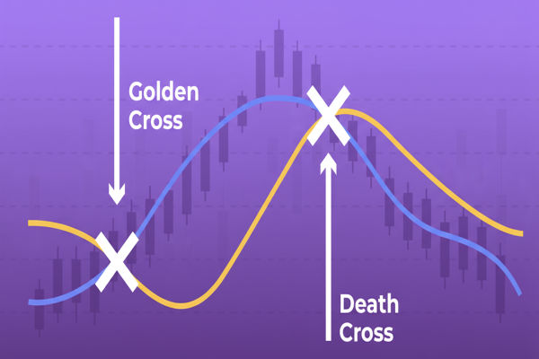
A Golden Cross is a bullish chart pattern that occurs when a shorter-term moving average (typically the 50-day) crosses above a longer-term moving average (typically the 200-day).
Think of it like the sun rising after a long night. The market, which might have been gloomy or sideways, is showing a new dawn; a signal that buyers are gaining strength and momentum, and are shifting upward.
The 50-day moving average rises above the 200-day moving average.
Usually indicates a strong upward trend is forming.
Often accompanied by higher trading volumes.
A Golden Cross suggests that short-term momentum is strong enough to overtake the long-term trend. It often sparks bullish sentiment, attracting more buyers and sometimes even large institutions.

On the opposite side of the spectrum is the Death Cross, a bearish chart pattern. It occurs when the 50-day moving average falls below the 200-day moving average.
Imagine the sun setting and nightfall creeping in. The market, which may have been strong before, is now losing steam, with sellers overtaking buyers.
The 50-day moving average falls below the 200-day moving average.
Often signals the beginning of a prolonged downtrend.
Can be accompanied by higher selling volumes.
A Death Cross is viewed as a warning signal. It doesn't always mean disaster, but it highlights that momentum has shifted downward and the market could face a bearish phase.
| Feature | Golden Cross | Death Cross |
|---|---|---|
| Type of Signal | Bullish (uptrend) | Bearish (downtrend) |
| Moving Average Interaction | 50-day MA crosses above 200-day MA | 50-day MA crosses below 200-day MA |
| Market Sentiment | Optimism, growth potential | Caution, risk of decline |
| Volume Behavior | Often rising | Often declining or panic selling |
| Typical Context | After a market consolidation or correction | After a prolonged uptrend loses momentum |
In short, the Golden Cross and Death Cross are like mirror images of each other. One signals optimism, the other caution.
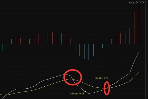
To understand why traders rely on these patterns, let's break down the tool behind them: moving averages (MA).
A moving average resembles the "average pace" of the market across a specified number of days.
The 50-day MA is short-term, reflecting traders' more immediate optimism or fear.
The 200-day MA is long-term, reflecting the broader trend.
When the short-term average overtakes the long-term, it's like the present is outrunning the past, signalling potential for a new bullish era (Golden Cross).
The opposite (Death Cross) shows the short-term collapsing under the weight of the long-term, hinting at possible weakness.

1. S&P 500 in July 2020
After the COVID-19 crash in March 2020, the 50-day moving average climbed above the 200-day moving average, forming a Golden Cross. This signal preceded a strong rally from 12 to 18 months.
2. Bitcoin in April 2019
BTC formed a Golden Cross near $5,000. Afterwards, it entered a bullish phase, climbing toward the $12,000+ zone later that year.
1. S&P 500 Circa 2007
Many technical analysts point to a Death Cross near the onset of the global financial crisis in 2007. Although specific crossover dates differ based on chart methods, they act as a historical benchmark for how moving average signals have coincided with market declines.
2. Bitcoin in June 2021
BTC's 50-day average fell below its 200-day average around mid-2021 (charted near $35,000 in many analyses), marking a Death Cross during a major pullback in the crypto market.
These examples demonstrate that although Golden and Death Crosses are never perfect predictors, they often coincide with major trend shifts in markets.
Investors may view a Golden Cross as an indication to maintain or increase their positions, whereas a Death Cross could prompt them to reduce exposure or hedge their portfolios.
Swing traders seek validation through volume and additional indicators to capitalise on medium-term trends stemming from crossovers.
Although Golden and Death Crosses are usually applied to daily charts, some day traders also adapt them to shorter time frames (e.g., 1-hour or 15-minute charts).
If you're starting, these patterns can help you understand how trends form and shift. However, remember: they are tools, not guarantees.
A beginner should:
Practice identifying Golden and Death Crosses on historical charts.
Use them in demo accounts before risking real money.
Combine them with other indicators to avoid over-reliance.
The other indicators' combination includes:
Volume Analysis: A rising volume during a Golden Cross is a stronger bullish confirmation.
Relative Strength Index (RSI): Helps check if the market is overbought or oversold.
MACD (Moving Average Convergence Divergence): Offers additional momentum insights.
Support and Resistance Levels: Help gauge realistic entry and exit points.
Neither is inherently "better." Their value depends on context:
In strong bull markets, a Golden Cross is frequently more dependable.
In uncertain or volatile markets, a Death Cross can flash false alarms.
The key is to look beyond the cross and analyse the broader picture.
Neither is foolproof. Historically, Golden Crosses have often led to stronger, sustained uptrends, whereas Death Crosses present a higher likelihood of false signals.
Yes. Sometimes the price reverses after a crossover with little follow-through. These are called "false crossovers" or whipsaws.
The daily chart (50-day vs 200-day) is most commonly used for medium- to long-term trading. Some traders also apply shorter (e.g. 20/50) or longer (100/200) MAs depending on their style and timeframe.
In conclusion, the Golden Cross and Death Cross are powerful signals, but they aren't fortune-tellers. Think of them as road signs on the trading highway; they guide you, but you still need to keep your hands on the wheel and your eyes on the road.
Disclaimer: This material is for general information purposes only and is not intended as (and should not be considered to be) financial, investment or other advice on which reliance should be placed. No opinion given in the material constitutes a recommendation by EBC or the author that any particular investment, security, transaction or investment strategy is suitable for any specific person.