Published on: 2023-11-20
Updated on: 2026-05-05
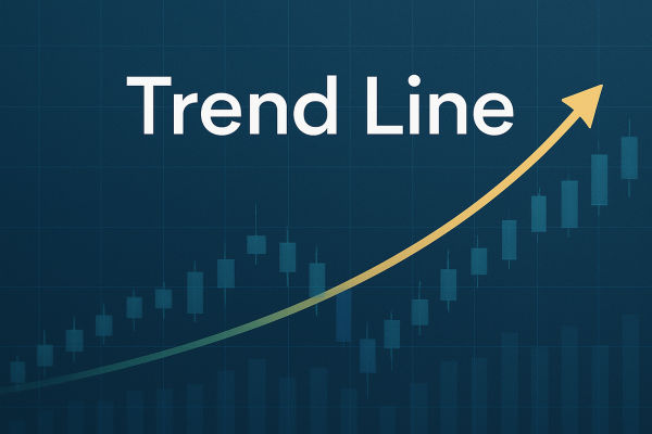
Trendline Drawing turns a noisy price chart into a clearer map of market structure. A well-drawn trendline shows where buyers have defended higher lows, where sellers have rejected lower highs, and where a break may warn that momentum is changing. Its value is not in predicting every move. It shows the price zones where traders should pay closer attention.
OTC foreign exchange turnover reached $9.6 trillion per day in April 2025, up 28% from 2022, while U.S. equities' average daily volume rose 44.6% year over year to 17.6 billion shares in 2025. Gold also set 53 new all-time highs during 2025, showing how powerful trends can extend before finally correcting. In this environment, trendlines need confirmation, not guesswork.

Trendline Drawing identifies market direction by connecting major swing highs or swing lows.
An uptrend line connects higher lows, indicating that buyers continue to defend the price.
A downtrend line connects lower highs, showing where sellers continue to cap rebounds.
Three clean touches are stronger than two, because they reduce subjectivity.
Breakouts need confirmation through candle closes, volume, volatility, retests, or momentum indicators.
Trendlines work best with support, resistance, moving averages, RSI, MACD, and multi-timeframe analysis.
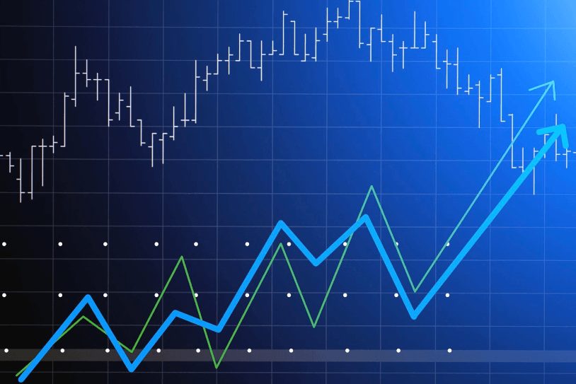
A trendline is a straight line drawn on a price chart to show the direction of a market trend. It connects important turning points rather than every small candle movement.
In an uptrend, price forms higher highs and higher lows. The trendline is normally drawn below the price by connecting rising swing lows. This line acts as dynamic support. When price pulls back toward it, and buyers return, the uptrend remains intact.
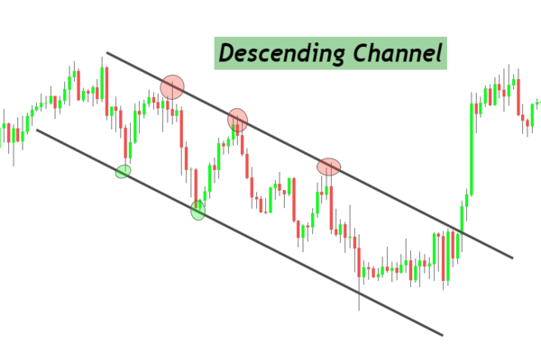
In a downtrend, price forms lower highs and lower lows. The trendline is normally drawn above the price by connecting falling swing highs. This line acts as dynamic resistance. When price rallies toward it and sellers return, the downtrend remains intact.
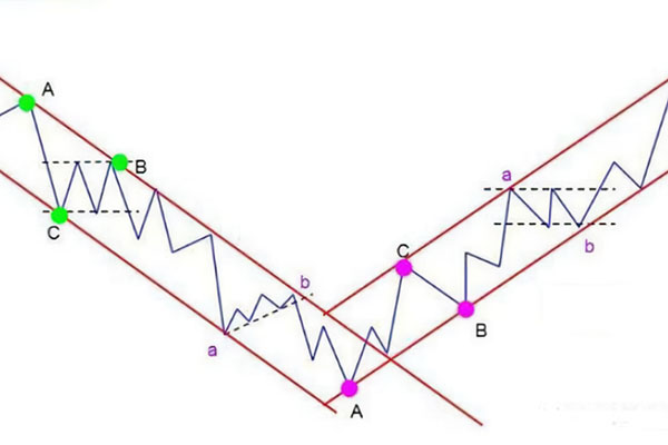
A horizontal trendline is different. It connects repeated highs or lows around the same price area and marks support or resistance rather than trend direction.
The first step is to identify clear swing points. These are visible areas where price changes direction. A trendline drawn through random candles has little value.
A line with two touches can be useful, but it is still early. A line with three or more clean reactions carries more weight because the market has repeatedly respected it.
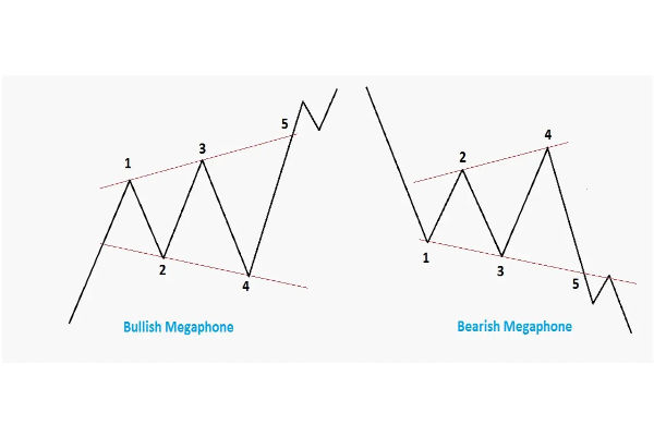
The slope is also important. A gentle rising trendline often indicates a healthier, more sustainable trend. A very steep trendline may show strong momentum, but it can break quickly when buyers take profit or volatility rises.
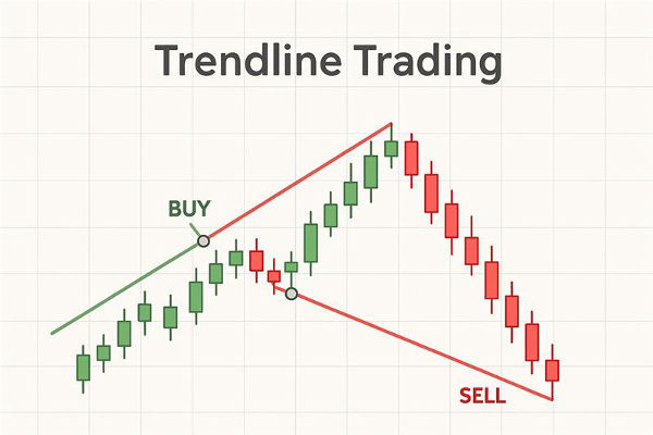
To draw an uptrend line, first find a market that is making higher lows. Use the trendline tool to connect at least two clear swing lows, then extend the line to the right.

The line does not need to touch every candle perfectly. Markets create wicks, gaps, and short-term noise. The goal is to connect the main structure, not force the line through every price movement.
A good uptrend line should:
connect visible swing lows;
slope upward from left to right;
have at least two touches, preferably three;
avoid cutting through too much price action;
match the broader trend on the higher timeframe.
When the price approaches the line again, traders watch the reaction. A bullish candle near the line may confirm support. A strong close below the line may show that momentum is weakening.
To draw a downtrend line, identify a market that is making lower highs. Connect two or more clear swing highs and extend the line forward.

A downtrend line helps traders see where sellers have been entering. If price rallies into the line and fails, the downtrend remains valid. If the price closes above the line with strength, the market may be shifting.
A strong downtrend line should:
connect clear lower highs;
slope downward from left to right;
Mark repeated selling pressure.
avoid cutting through major price bodies;
be checked against higher timeframes.
For example, a currency pair may rally on a 1-hour chart but remain below a falling daily trendline. In that case, the higher timeframe still carries more weight.
Horizontal trendlines mark support and resistance. Support is an area where buyers previously stepped in. Resistance is an area where sellers previously appeared.
These levels matter because markets often react to old price zones. A former resistance level can become support after a breakout. A former support level can become resistance after a breakdown.
Horizontal lines are especially useful in range markets. When the price moves sideways, the trend direction is weak. In this environment, traders should focus more on range highs and lows and on breakout confirmation.
Trendlines are useful for more than identifying direction. They also help with timing, trade planning, and risk management.
In an uptrend, traders may look to buy when the price pulls back toward a rising trendline and shows a bullish reaction. In a downtrend, traders may look to sell when the price rebounds toward a falling trendline and then fails.
Trendlines also help traders avoid chasing prices. Instead of entering after a large move, traders can wait for the price to return to a meaningful level. This creates a more disciplined setup.
A simple approach is to ask three questions before using a trendline signal: Is the trend clear? Has the price respected the line before? Is there confirmation from another tool?
A trendline break does not automatically mean the trend has reversed. This is one of the most common mistakes in technical analysis.
In forex, gold, indices, and stocks, prices can briefly pierce a trendline before returning to the original direction. This is often called a false breakout. It can happen around major economic data, low-liquidity sessions, or crowded technical levels.
A stronger breakout usually has several features:
a candle close beyond the trendline;
a wider range than recent candles;
stronger volume or momentum;
confirmation from RSI, MACD, or moving averages;
a retest of the broken trendline.
The old rule that a breakout must exceed 3% may be useful in some stock market analysis, but it is too rigid for all markets. Forex pairs, gold, indices, and individual shares have different volatility profiles. A better method is to compare the breakout with the recent average range, timeframe, and nearby support or resistance.
Trendlines and moving averages are related, but they are not the same.
A trendline is drawn manually by connecting important highs or lows. It reflects the market structure and traders' interpretations. A moving average is calculated from past closing prices over a fixed period.
When a rising trendline aligns with a 50-day moving average, the support area becomes more important. When a falling trendline overlaps with the 200-day moving average, the resistance zone may attract stronger attention.
The best signals often appear when trendlines, moving averages, support and resistance, and momentum indicators point in the same direction.
Most traders draw trendlines visually, but a trendline can also be expressed through a simple linear equation:
Y = a + bX
The slope shows direction. If the slope is positive, the line rises. If the slope is negative, the line falls. If the slope is close to zero, the market is moving sideways.
Linear regression tools can help create more objective trendlines, especially when analysing larger data sets. Still, manual Trendline Drawing remains useful because it focuses on visible market structure.
The first mistake is forcing a line to fit a bias. If a trader already wants to buy, they may draw a line that supports that view even when the price structure does not confirm it.
The second mistake is using too many lines. A chart full of trendlines becomes hard to read. The best analysis usually uses only the most important levels.
The third mistake is ignoring the timeframe. A 5-minute trendline may break several times while the daily trend remains intact.
The fourth mistake is treating every wick as a breakout. A candle close, retest, and confirmation signal are more reliable than a brief move through the line.
Trendline Drawing is the process of connecting important highs or lows on a price chart to identify market direction, support, resistance, and possible breakout areas. It helps traders read structure more clearly.
Two points are enough to draw a trendline, but three touches make it more reliable. More valid touches show that the market has respected the line repeatedly.
Both can be useful. Wicks show price extremes, while closing prices show the market accepted value. For breakout confirmation, closing prices are usually more reliable.
Trendlines do not predict future prices with certainty. They identify areas where price may react. Traders should combine them with momentum, volume, support, resistance, and risk management.
Yes. Trendlines are widely used in forex because currency pairs often move in directional waves. However, forex traders should confirm breaks carefully because false breakouts can occur around news and liquidity shifts.
Trendline Drawing remains valuable because it turns price action into a clear visual structure. A good trendline can show trend direction, support, resistance, breakout risk, and possible entry zones. The key is discipline. Draw from meaningful swing points, avoid forcing the line, confirm breakouts with price closes and momentum, and compare signals across timeframes. Used this way, trendlines become more than simple chart markings. They become a practical framework for reading market behaviour.
Disclaimer: This material is for general information purposes only and is not intended as (and should not be considered to be) financial, investment or other advice on which reliance should be placed. No opinion given in the material constitutes a recommendation by EBC or the author that any particular investment, security, transaction or investment strategy is suitable for any specific person.